Revamping Wamo’s Brand Identity
Wamo is a digital banking solution designed to empower small and medium businesses (SMBs) by offering flexible, digital-first financial tools. NOIN was entrusted with the task of refining and transforming Wamo’s brand identity to position it as a trusted partner for SMBs, fostering trust, stability, and partnership at every step of their entrepreneurial journey. The overarching goal of this project was to establish Wamo as a forward-thinking, reliable partner for modern businesses, appealing especially to younger generations looking for innovative and digital-first banking solutions.
Client
WAMO
Involvement
Concept Design, User Experience Design, Digital Branding, Marketing
“Building a brand, finding the brand’s core, communicating the brand values, rebranding, and many more... Not an easy job. It takes months, discussions, and countless meetings and it still continues.
On this journey, we’re very grateful that we had great partners like NOIN. They listened, they understood, and they brought our brand to a different level.”


Challenge
The primary challenge was to transform Wamo’s existing identity into one that radiated professionalism, simplicity, and fluidity, without losing touch with its original ethos. Wamo needed to stand out in a crowded fintech space while maintaining a strong emotional connection with its target audience: small business owners and entrepreneurs seeking both innovation and trustworthiness in their financial partner.
The brand overhaul had to strike a delicate balance—retaining elements of Wamo’s heritage while presenting a fresh, modern appeal that resonated with today’s tech-savvy, entrepreneurial generation. The aim was to create a brand identity that not only conveyed Wamo’s innovative capabilities but also emphasized its commitment to supporting small businesses in a competitive digital landscape.
Solution
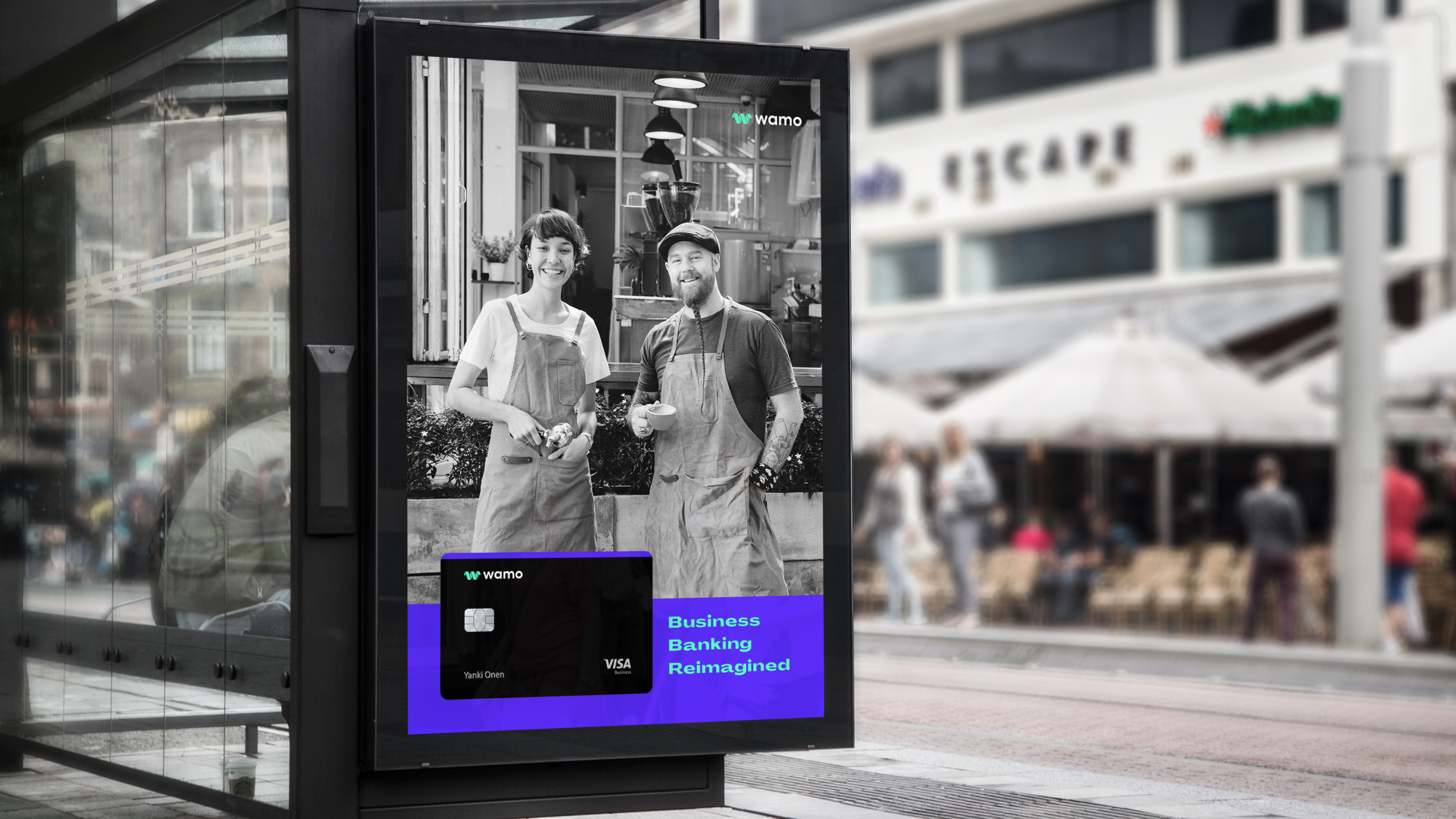
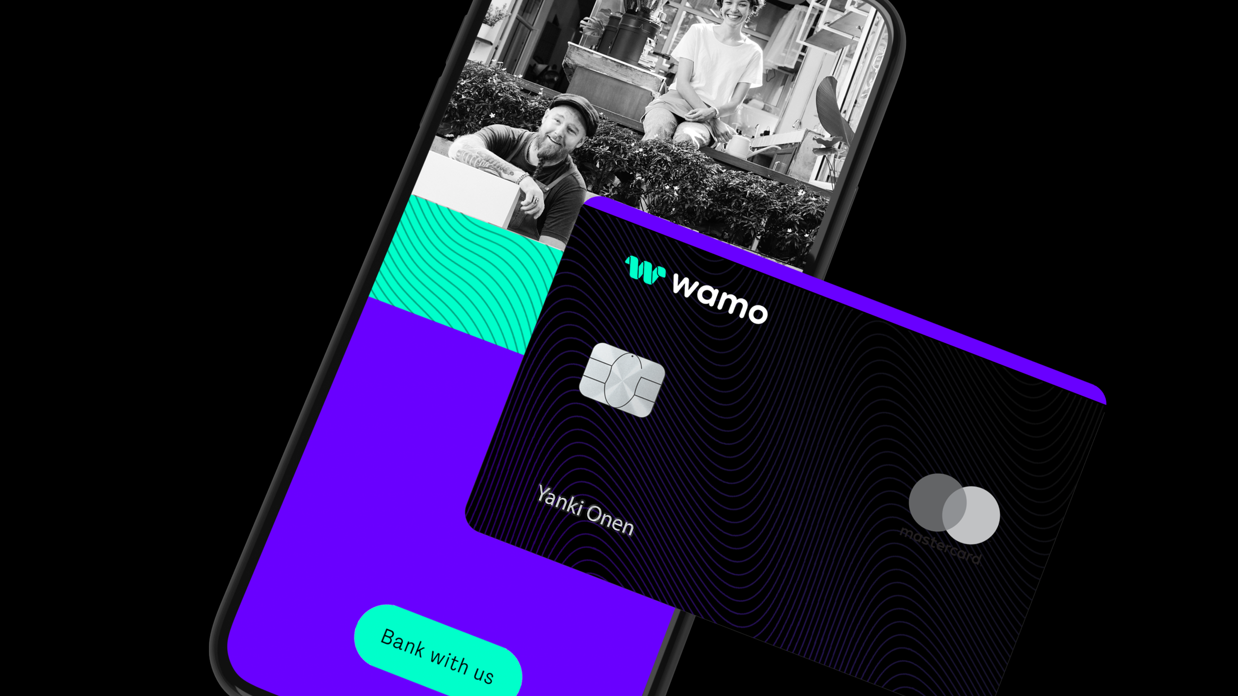
NOIN approached this transformation by redefining Wamo’s brand identity through a strategic blend of its heritage and a bold new aesthetic. We emphasized professionalism and trust, while keeping the design modern, dynamic, and approachable. The visual elements were designed with Wamo's core audience—young professionals and entrepreneurs—in mind. We retained key elements of the original identity but introduced bold, geometric shapes, vibrant color palettes, and robust typography to give Wamo an avant-garde edge.
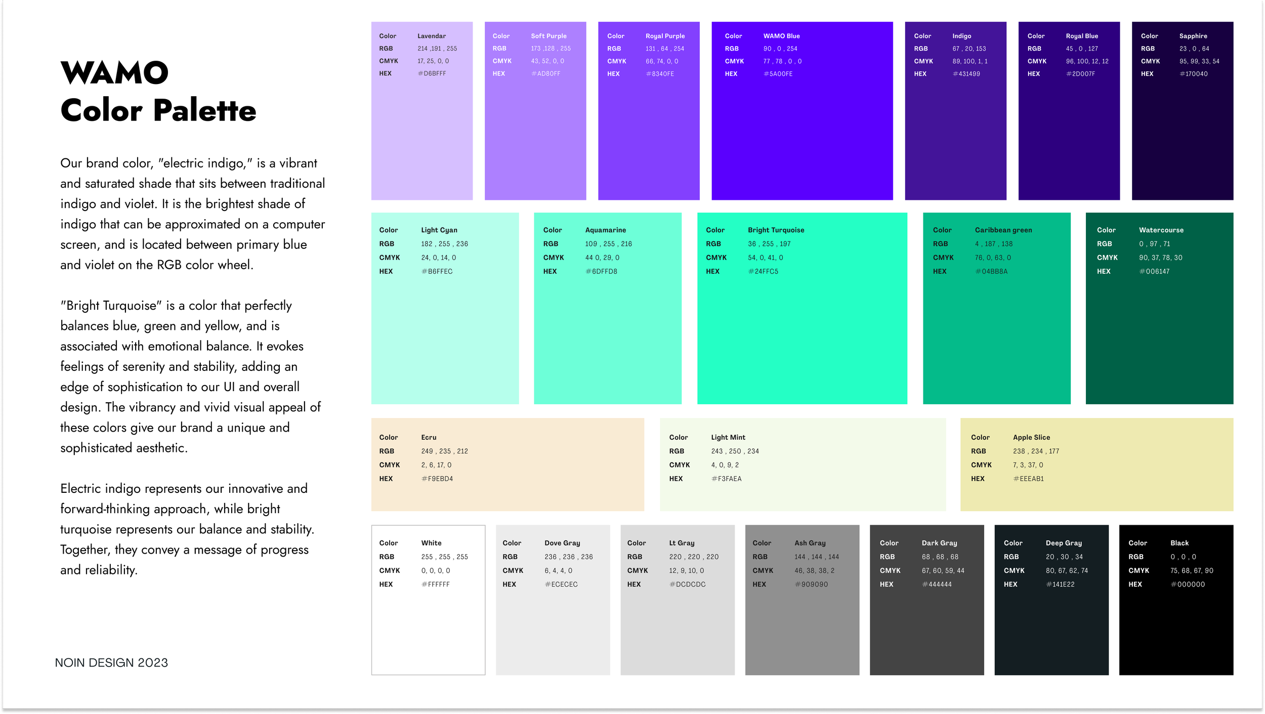
The color scheme, led by Electric Indigo and Bright Turquoise, reflects energy, innovation, and stability—qualities that are essential for Wamo’s audience. These vibrant hues, combined with monochromatic images of small business owners, foster a people-centric approach that underscores Wamo’s commitment to championing SMBs. This combination of bright colors and black-and-white imagery strikes a balance between forward-thinking innovation and solid dependability.
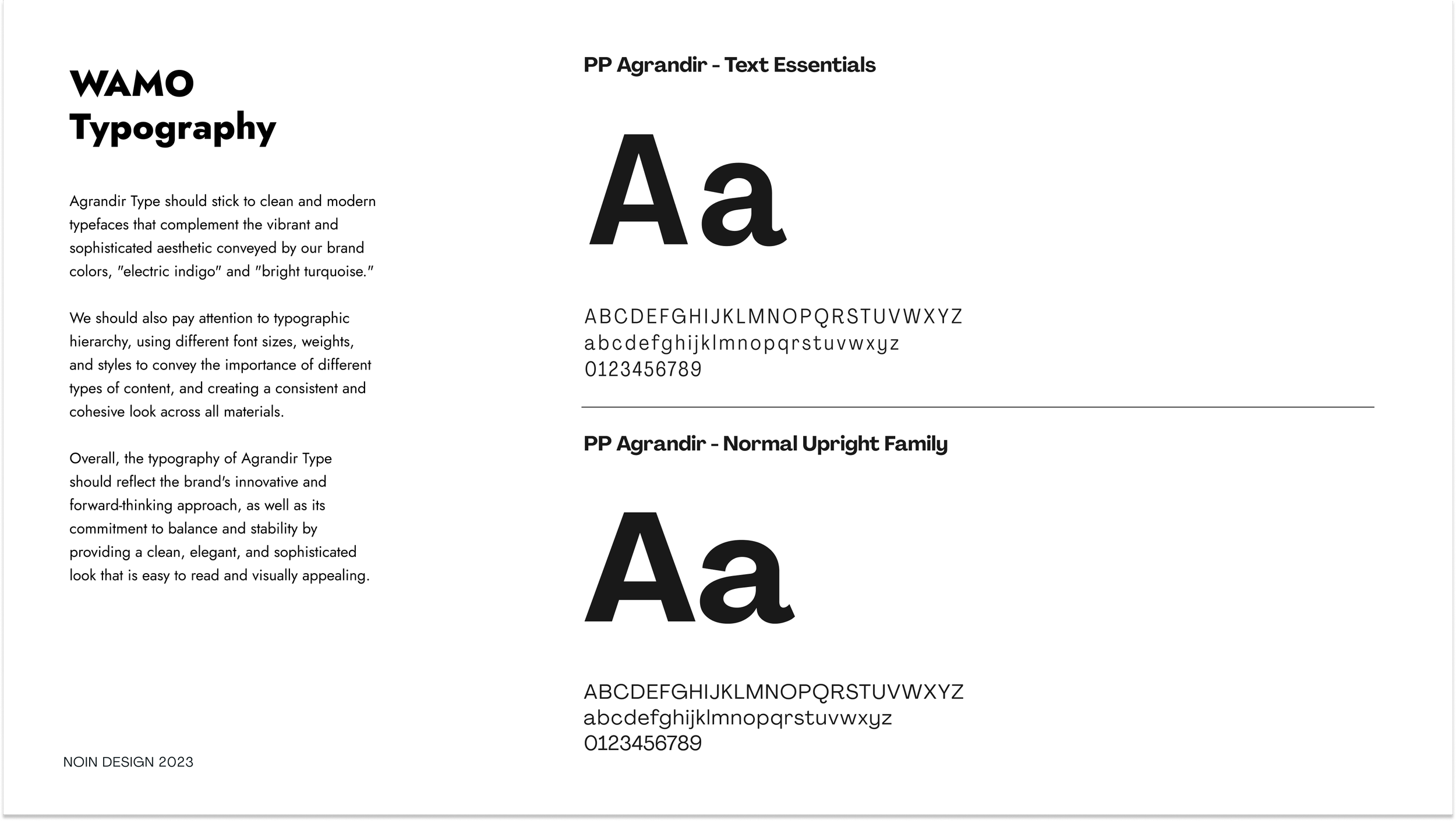
The typography, PP Agrandir, was chosen for its clean, modern aesthetic, reflecting a sense of stability and simplicity. The use of bold type treatments and dynamic layouts further emphasizes Wamo’s role as a strong, reliable partner for SMBs.
Results
The newly refined Wamo brand identity has revitalized the company’s image, giving it a distinct, avant-garde appeal while maintaining the trustworthiness of its original ethos. The brand now projects a renewed sense of professionalism, innovation, and accessibility, establishing Wamo as a reliable and forward-thinking partner for small and medium businesses.
Since the rebrand, Wamo has seen increased engagement across digital channels, with a stronger connection to its target audience of modern entrepreneurs and SMBs. The new brand identity has significantly improved customer trust and brand recall, positioning Wamo for sustained growth in the fintech industry.